Start with shade depth, then consider undertone
Foundation shades have two useful parts: depth, or how light or deep the color is, and undertone, the subtle cast beneath it. Shade labels can help you narrow the options, but names such as “beige” or “warm” are not consistent across brands. Treat them as a starting point rather than a final answer.
First, look for a depth that seems close to your bare skin. Then compare undertones within that range. Warm shades may lean golden or peach, cool shades may lean pink or rosy, and neutral shades sit somewhere between. Olive shades can have a muted greenish or grayish cast. You do not need to settle on a permanent label for your skin; the useful question is which foundation looks least noticeable once applied.
Swatch where the match needs to work
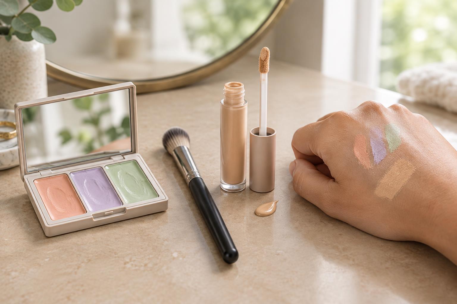
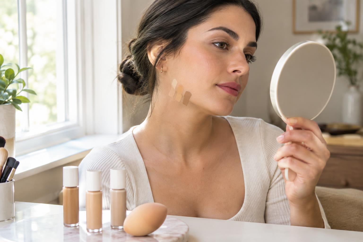
If possible, choose two or three nearby shades and place a small stripe of each along your lower cheek and jawline. Leave a little space between stripes so you can see their edges. Your hand or wrist may be convenient for testing texture, but their color can differ from your face, making them less reliable for choosing a shade.
Look at how each stripe relates to your face, neck, and the skin visible at your neckline. A shade does not have to match every area perfectly. The goal is a smooth transition, especially if your face is slightly lighter or darker than your neck. If one stripe looks orange, pink, pale, or ashy beside the surrounding skin, set it aside even if its shade name sounded right.
Make the natural-light check
Indoor lighting can change how color appears. Warm bulbs may make a shade look more golden, while cooler lighting can emphasize pink or gray tones. After swatching, move near a window with indirect daylight or step outside into open shade. Avoid judging the match in harsh direct sun, which can create strong highlights and shadows.
Check your face from a comfortable viewing distance as well as up close. Turn slightly from side to side and look at both the swatches and the overall transition from jaw to neck. The strongest candidate will usually fade into the surrounding skin without leaving a distinct stripe. If you can only test under store lighting, take note of your likely choices and, if available, try a sample at home before buying a full size.
Test a small area the way you will wear it
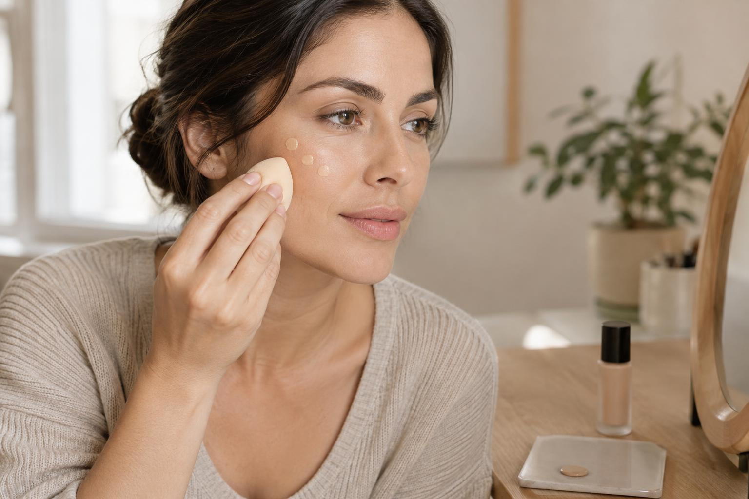
A narrow stripe is helpful for comparing colors, but a blended patch gives you a better sense of the finished look. Apply a little of the leading shade to one side of your face using your usual fingers, sponge, or brush. Blend it as you normally would, keeping coverage light at first. Heavy application can make even a close match look more obvious.
Give the product a few minutes to settle, then check it in daylight again. Some formulas may look different as they dry or mix with the products underneath, so the first wet swatch is not always the best guide. Also notice the finish: a matte or dewy surface can affect how you perceive the color, even when the shade itself is close.
Choose the most useful match, not a perfect label
If you are deciding between two close shades, consider where and how you wear foundation. A lighter-coverage formula can be more forgiving because more of your natural skin shows through. With fuller coverage, a slight mismatch may be easier to see along the jaw. Choose the shade that looks cohesive across your face and neckline after blending, rather than one that matches a single spot exactly.
Your best match may change when your skin tone changes with the seasons. Before buying another shade, check whether a lighter application or a different placement solves the issue. When you do need a new match, repeat the same jawline and daylight check. It is a simple routine that works better than relying on a shade name, a wrist swatch, or a bathroom mirror alone.